Colour Sketching Effect
The idea for this effect is to make your image look like it was sketched with coloured pencils or pastels.
This example was using Gimp 2.2 version.
An example of this effect is with this icon image: 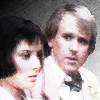
I assume you already have a picture with your person-sans-background. (Note that the background in this example image was done with a different effect.)
- Make a duplicate of your people layer. Call it "d1".
- Desaturate the layer with Layer -> Colors -> Desaturate. You may wish to play around with the "levels" window Layer -> Colors -> Levels to make the layer a bit brighter; first see if the "Auto" option makes it look cleaner.
- Make a duplicate of "d1"; call it "d2".
-
In d2, play with the "GIMPressionist" window Filters -> Artistic -> GIMPressionist to give a sort of sketching effect. The "Line Art" option-sets can be good, or the "Furry" one.
You may need to set the option in "General" to keep the background transparent, if you want to do your own thing with the background of the whole picture. However, it is probably not a good idea for the d2 layer itself to have the "Keep transparency" option (in the Layers window) to be clicked, as that could make the edges of your people look too hard-edged.
You may have to come back and tweak around with this step to get the effect you want.
- Hide layer d1. Set d2 layer mode to "Addition". This will white out the lighter parts, as if this were on white paper, and the darker parts will come across as if they were sketched in pastel or coloured pencil. You can also use "Lighten only" for a less strong effect.
- You may wish to adjust the colourfulness of the image, either
up or down (or both, to get more subtle effects).
- To decrease the colourfulness, take the desaturated layer, d1 (see, there was a reason for keeping it!) and move it above the other layers. Un-hide it, and put it in "Overlay" mode. You may wish to adjust its opacity to reduce the effect.
- To increase the colourfulness:
- duplicate your original people layer, and call the new layer "p2". Make sure it is above your people layer but below d1 and d2.
- Apply either the "Retinex" filter Filters -> Color -> Retinex or the "Color Enhance" filter Layer -> Color -> Auto -> Color Enhance to increase the colourfulness of p2.
- This can be very colourful, so to tone it down a bit, either change the mode of p2 (Overlay, or Screen or Grain Merge) or decrease the opacity of p2 (or both). Adjust to taste.
For the example image, I ended up doing both increasing and decreasing the colourfulness; it gave a different effect than just keeping the original people layer.
- So now you have your sketch effect, you can do other things, like save it, or mess around with the background.
A note about the background of the example image
Just in case you were curious, the background of the example image above was done by:
- Make a new white layer below your people.
- Gradient-fill the layer with a black-to-white gradient, linear, from one corner to the other.
- Make a new transparent layer, and set its mode to "overlay".
- Fill this layer with a pattern-fill. In this case it was the "Paper" pattern, which I find a very useful texture.